JoomlaXTC Socializer Wall module
Manage dozens of social network links with total layout and style control with pre-made templates or use your own custom HTML and CSS. Icons can be shown in rows, columns and grids with one or more pages as well as special animation effects for page transitions.
• 88 Social Networks icons each with 3 different styles
• Supports multiple module copies with different configurations
• Arrange icons in columns, rows and grids with one or more pages
• 42 button sets included
• 12 built-in templates
• 5 data tags to display information such as title, link URL, alias, icon and position
• JXTC Showcase Library for Sliders, Tooltips, Pop-ups and more animation effects.
• 100% Joomla Moo compatible effects.
• Fully customizable Main and More Area HTML/CSS templates
Installation
Installation is done as with any standard Joomla extension following these steps:- Download the extension zip file to your PC
- Use the standard Joomla Extension Manager to install the file.
Configuration
Use the Extensions / Module Manager menu option in Joomla's administrator page to edit the module parameters. For better results, make sure the module is in a Disabled state at first while you configure it to prevent any bad data or other disruption to your website frontend. Enable the module once you are done setting the parameters.
Module parameters are split in two main groups described below:
Basic Options
The module offers a few parameters for each Social Network and there are dozens of networks supported therefore the amount of parameters may look overwhelming at first. However, they are neatly grouped together and you will soon find how easy is to set them up.
Each Social Network parameter group behaves exactly the same, so we will focus on explaining only one. The parameters available on each group are:
Selection Parameters
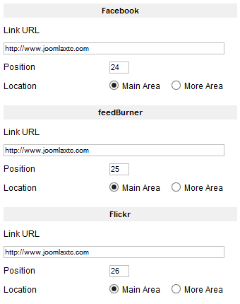
- Link URL
- This is the full URL to your Profile page on the Social Network's site. Using a preloaded template or your own custom HTML markup will make your users jump to this page when the link is clicked. You can also use any other URL you want.
- Position
- Sometimes you may want to display certain icons before others. This parameter is a numeric value used to sort the icons display from low to high.
- Location
- As other Wall modules, displays can have "Main" and a "More" areas (learn more below). Use this parameter to select where do you want the icon to appear.
Use the following parameters to customize the layout of the module box. The layout consists of a grid made up with one or more pages of Joomla! articles organized in rows and/or columns.
Display Parameters
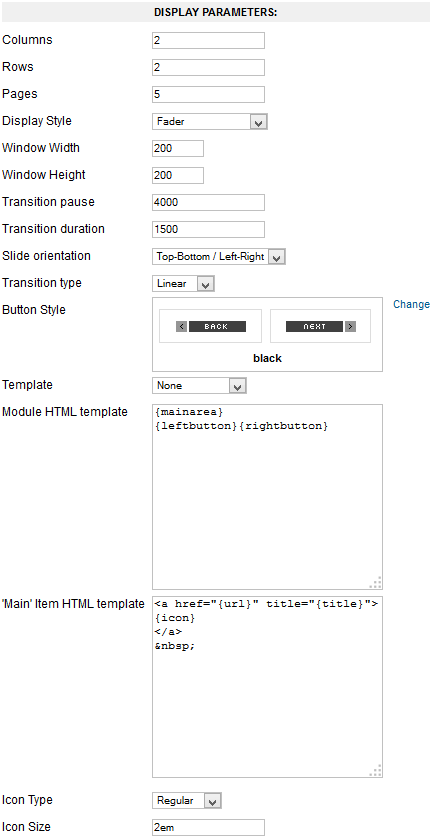
- Columns
- Number of columns to show.
- Rows
- Number of rows to show.
- Pages
- Number of pages to show. Transition effects are enabled between page changes.
- Display Style
- Special effects applied to the layout. Window modes work with one page only, all others require multiple pages of content to perform transitions between them.
- Window Width
- Width (in pixels) of the window frame when using a Window special effect.
- Window Height
- Height (in pixels) of the window frame when using a Window special effect.
- Transition pause
- Pause time between page transitions in milliseconds. A value of -1 disables automatic transitions. Default value is: 4000.
- Transition duration
- Page transition effect duration in milliseconds (default: 1500).
- Slide orientation
- Slide transition orientation.
- Transition type
- Transition animation type.
- Button Style
- Button graphic set to use when buttons tags are enabled.
- Template
- To select one of our predesigned template. NOTE: Use None to use the Module HTML template and Main Content HTML template parameters.
- Module HTML template
- HTML/CSS code to display the overall module markup box. You can embed any of the supported area tags as part of the markup:
{mainarea} Renders the block containing markup for all 'Main' items, including the special effects. {morearea} Renders the block containing markup for all 'More' items. {leftbutton} Inserts a "Left/Back/Previous" button. {rightbutton} Inserts a "Right/Forward/Next" button. {pages} Inserts numbered page links for quick browsing. - 'Main' Item HTML template
- HTML/CSS code to display each item. You can embed any of supported item tags as part of the markup (see below).
- Icon Type
- Choose from any of the available icon font types. The icon is drawn as a text character so you can style it using CSS.
- Icon Size
- Enter the size of the icon character. Use any valid CSS font size value such as 12px, 1.25em, 130%, etc.
'More' Area Configuration
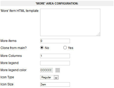
- 'More' Item HTML template
- HTML/CSS code to display each item. You can embed any of supported item tags as part of the markup (see below).
- More Items
- Enter the number of additional items to show on this area.
- Clone from Main?
- If enabled, the items from 'Main' area will be used instead.
- More Columns
- Number of columns to show. Items will be arranged on one or multiple rows according to this value.
- More Legend
- The more area can contain a title string on top. Enter the desired text here.
- More Legend Color
- Set the color of the title legend string (format is: RRGGBB).
- Icon Type
- Choose from any of the available icon font types. The icon is drawn as a text character so you can style it using CSS.
- Icon Size
- Enter the size of the icon character. Use any valid CSS font size value such as 12px, 1.25em, 130%, etc.
Advanced Options
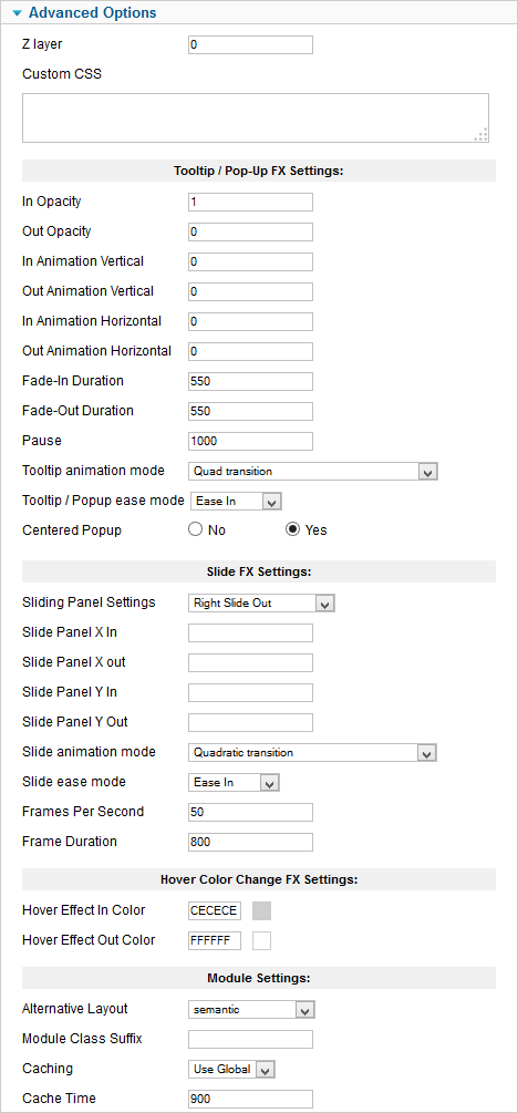
- Z layer
- Define the z-index layer to use for the special effect content.
- Custom CSS
- Enter any custom CSS markup you need for styling.
Use these parameters to customize the Tooltip and Pop-Up effects:
- In Opacity
- The opacity of the tooltip/pop-up when the mouse enters the trigger zone. A value of 0 will make the display transparent while a value of 1 will make it opaque, values range from 0 to 1 in decimal increments.
- Out Opacity
- The opacity of the tooltip/pop-up when the mouse leaves the trigger zone. A value of 0 will make the display transparent while a value of 1 will make it opaque, values range from 0 to 1 in decimal increments.
- In Animation Vertical
- The distance the tooltip/pop-up will move vertically (in pixels) when the mouse enters the trigger zone.
- Out Animation Vertical
- The distance the tooltip/pop-up will move vertically (in pixels) when the mouse leaves the trigger zone.
- In Animation Horizontal
- The distance the tooltip/pop-up will move horizontally (in pixels) when the mouse enters the trigger zone.
- Out Animation Horizontal
- The distance the tooltip/pop-up will move horizontally (in pixels) when the mouse leaves the trigger zone.
- Fade-in Duration
- The duration of the "In" animation when the mouse pointer enters the trigger zone (in milliseconds).
- Fade-Out duration
- The duration of the "Out" animation when mouse pointer leaves the trigger zone (in milliseconds).
- Pause
- The time the tooltip/pop-up will be shown between the "In" animation and the "Out" animation (in milliseconds).
- Tooltip animation mode
- Select one of the many Moo functions to perform animations.
- Tooltip / Popup ease mode
- The transition type. All transitions, except for "linear" transition, can be combined with a "Transition Ease".
- Centered Popup
- Set this to "Yes" if you want pop-up effect displays to appear centered in the browser window.
These parameters control the "Slide" content effect:
- Sliding Panels Settings
- Choose an animation style from the list.
- Slide Panel X in
- The distance (in pixels) from the left trigger zone border that the custom slide panel will go to when the mouse enters the trigger zone.
- Slide Panel X out
- The distance (in pixels) from the left trigger zone border that the custom slide panel will go to when the mouse leaves the trigger zone.
- Slide Panel Y in
- The distance (in pixels) from the top trigger zone border that the custom slide panel will go to when the mouse enters the trigger zone.
- Slide Panel Y out
- The distance (in pixels) from the top trigger zone border that the custom slide panel will go to when the mouse leaves the trigger zone.
- Slide animation mode
- Select one of the many Moo functions to animate the slide effects.
- Slide ease mode
- Choose how to apply the animation effect. This setting is not used when "Slide Animation Mode" is set to Linear.
- Frames per Second
- The frames per second used to animate the effect. Note: Using a high value in a heavy site could decrease the video performance. Combine this setting with "Frame Duration" to get a smooth effect.
- Fame Duration
- The time (in milliseconds) the duration will last.
These Parameters Control the Hover Effect:
- Hover Effect in Color
- The background color that will fade in when mouse enter the element with class="js_hover".
- Hover Effect Out Color
- The background color that will fade out when mouse leaves the element with class="js_hover".
Using data tags
Data tags work as placeholders of information within the HTML code of your item template. Once the parameters are set, the module will loop thru all the available items adding the template code to the content areas and replacing the data tags with the corresponding bit of data.
These are the available item tags:
| {title} | Title of the Social Network. |
| {alias} | A string representing the Social Network name. Useful for custom CSS styling classes. |
| {url} | The URL of the Social Network link. |
| {icon} | The icon character. Use CSS class 'symbol' to style it. |
| {index} | A consecutive number for each item. |
CSS Styling
The module contains 12 demo templates to get you started. Probably your first question is how to change the colors of the icons? We have included a class for each icon in our templates, simply add the hex color value to the div class a viola your set!
Troubleshooting
The module contains many parameters and Joomla may struggle to save them; this could be a problem on some very slow computers. For improved performance, edit the module's .xml file and remove parameter groups from unused Social Networks. Alternatively, click on the Continue option if your browser detects a slow JavaScript program execution.
JoomlaXTC Socializer Wall uses font code Copyright © 2013 by Ivan Drinchev used under license.