JoomlaXTC Komento Wall module
Display comment lists anywhere on your site with total layout and style control. Use pre-made templates or create your own custom HTML and CSS templates to show messages in rows, columns and grids with one or more pages as well as special animation effects for page transitions. Komento Wall is the easiest way to display comments in "most recent", "top rated" lists and many more ways.
• Supports multiple module copies with different configurations
• Arrange comment data in columns, rows and grids with one or more pages
• 42 button sets included
• 34 built-in templates
• 21 data tags to display information such as title, links, alias, avatars and more
• JXTC Showcase Library for Sliders, Tooltips, Pop-ups and more animation effects
• 100% Joomla Moo compatible effects
• Fully customizable Main and More Area HTML/CSS templates
Installation
Installation is done as with any standard Joomla extension following these steps:- Download the extension zip file to your PC
- Use the standard Joomla Extension Manager to install the file.
Configuration
Use the Extensions / Module Manager menu option in Joomla's administrator page to edit the module parameters. For better results, make sure the module is in a Disabled state at first while you configure it to prevent any bad data or other disruption to your website frontend. Enable the module once you are done setting the parameters.
Module parameters are split in two main groups described below:
Basic Options
Selection Parameters
These parameters define the source and type of comment data to display, each comment will be an item that can have one or more data fields shown.
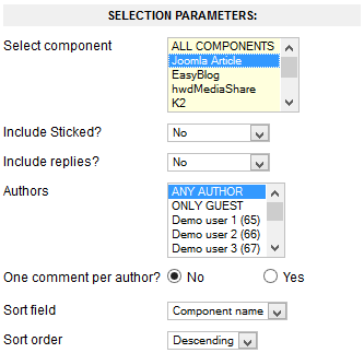
- Select Component
- Choose the source component for comments.
- Include Sticked?
- Choose to include comments marked as Sticked or not.
- Include replied?
- Replies to comments can also be selected for inclusion here.
- Authors
- Filter comments by Author, if needed.
- One comment per author?
- This option will show only one comment per author.
- Sort field
- Comments can be sorted in different ways, use this parameter to select their ordering.
- Sort order
- Use along the previous parameter to specify comment display order.
Use the following parameters to customize the layout of the module box. The layout consists of a grid made up with one or more pages of items organized in rows and/or columns.
Display Parameters
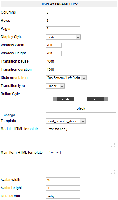
- Columns
- Number of columns to show.
- Rows
- Number of rows to show.
- Pages
- Number of pages to show. Transition effects are enabled between page changes.
- Display Style
- Special effects applied to the layout. Window modes work with one page only, all others require multiple pages of content to perform transitions between them.
- Window Width
- Width (in pixels) of the window frame when using a Window special effect.
- Window Height
- Height (in pixels) of the window frame when using a Window special effect.
- Transition pause
- Pause time between page transitions in milliseconds. A value of -1 disables automatic transitions. Default value is: 4000.
- Transition duration
- Page transition effect duration in milliseconds (default: 1500).
- Slide orientation
- Slide transition orientation.
- Transition type
- Transition animation type.
- Button Style
- Button graphic set to use when buttons tags are enabled.
- Template
- To select one of our predesigned template. NOTE: Use None to use the Module HTML template and Main Content HTML template parameters.
- Module HTML template
- HTML/CSS code to display the overall module markup box. You can embed any of the supported area tags as part of the markup:
{mainarea} Renders the block containing markup for all 'Main' items, including the special effects. {morearea} Renders the block containing markup for all 'More' items. {leftbutton} Inserts a "Left/Back/Previous" button. {rightbutton} Inserts a "Right/Forward/Next" button. {pages} Inserts numbered page links for quick browsing. - 'Main' Item HTML template
- HTML/CSS code to display each item. You can embed any of supported item tags as part of the markup (see below).
- Avatar width
- Width of avatar image (in pixels).
- Avatar height
- Height of Avatar image (in pixels).
- Date format
- Default date format for date/time values according to PHP date() function.
'More' Area Configuration
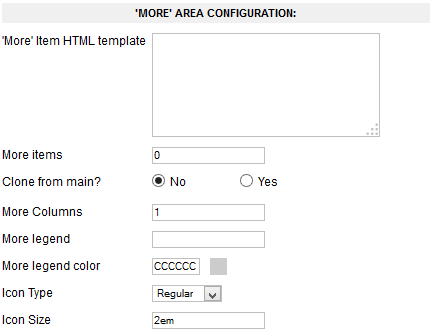
- 'More' Item HTML template
- HTML/CSS code to display each item. You can embed any of supported item tags as part of the markup (see below).
- More Items
- Enter the number of additional items to show on this area.
- Clone from Main?
- If enabled, the items from 'Main' area will be used instead.
- More Columns
- Number of columns to show. Items will be arranged on one or multiple rows according to this value.
- More Legend
- The more area can contain a title string on top. Enter the desired text here.
- More Legend Color
- Set the color of the title legend string (format is: RRGGBB).
Advanced Options
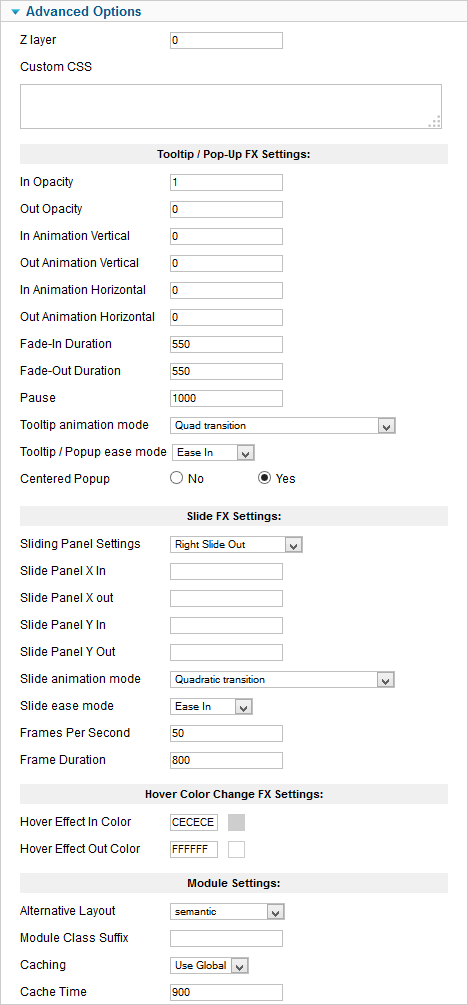
- Z layer
- Define the z-index layer to use for the special effect content.
- Custom CSS
- Enter any custom CSS markup you need for styling.
Use these parameters to customize the Tooltip and Pop-Up effects:
- In Opacity
- The opacity of the tooltip/pop-up when the mouse enters the trigger zone. A value of 0 will make the display transparent while a value of 1 will make it opaque, values range from 0 to 1 in decimal increments.
- Out Opacity
- The opacity of the tooltip/pop-up when the mouse leaves the trigger zone. A value of 0 will make the display transparent while a value of 1 will make it opaque, values range from 0 to 1 in decimal increments.
- In Animation Vertical
- The distance the tooltip/pop-up will move vertically (in pixels) when the mouse enters the trigger zone.
- Out Animation Vertical
- The distance the tooltip/pop-up will move vertically (in pixels) when the mouse leaves the trigger zone.
- In Animation Horizontal
- The distance the tooltip/pop-up will move horizontally (in pixels) when the mouse enters the trigger zone.
- Out Animation Horizontal
- The distance the tooltip/pop-up will move horizontally (in pixels) when the mouse leaves the trigger zone.
- Fade-in Duration
- The duration of the "In" animation when the mouse pointer enters the trigger zone (in milliseconds).
- Fade-Out duration
- The duration of the "Out" animation when mouse pointer leaves the trigger zone (in milliseconds).
- Pause
- The time the tooltip/pop-up will be shown between the "In" animation and the "Out" animation (in milliseconds).
- Tooltip animation mode
- Select one of the many Moo functions to perform animations.
- Tooltip / Popup ease mode
- The transition type. All transitions, except for "linear" transition, can be combined with a "Transition Ease".
- Centered Popup
- Set this to "Yes" if you want pop-up effect displays to appear centered in the browser window.
These parameters control the "Slide" content effect:
- Sliding Panels Settings
- Choose an animation style from the list.
- Slide Panel X in
- The distance (in pixels) from the left trigger zone border that the custom slide panel will go to when the mouse enters the trigger zone.
- Slide Panel X out
- The distance (in pixels) from the left trigger zone border that the custom slide panel will go to when the mouse leaves the trigger zone.
- Slide Panel Y in
- The distance (in pixels) from the top trigger zone border that the custom slide panel will go to when the mouse enters the trigger zone.
- Slide Panel Y out
- The distance (in pixels) from the top trigger zone border that the custom slide panel will go to when the mouse leaves the trigger zone.
- Slide animation mode
- Select one of the many Moo functions to animate the slide effects.
- Slide ease mode
- Choose how to apply the animation effect. This setting is not used when "Slide Animation Mode" is set to Linear.
- Frames per Second
- The frames per second used to animate the effect. Note: Using a high value in a heavy site could decrease the video performance. Combine this setting with "Frame Duration" to get a smooth effect.
- Fame Duration
- The time (in milliseconds) the duration will last.
These Parameters Control the Hover Effect:
- Hover Effect in Color
- The background color that will fade in when mouse enter the element with class="js_hover".
- Hover Effect Out Color
- The background color that will fade out when mouse leaves the element with class="js_hover".
Using data tags
Data tags work as placeholders of information within the HTML code of your item template. Once the parameters are set, the module will loop thru all the available items adding the template code to the content areas and replacing the data tags with the corresponding bit of data.
These are the available item tags:
| {id} | This tag will return the id value of the comment | |
| {processed_comment} | Use this tag to show the comment as it is show on the Komento component, notice that this tag will show the emoticons that are set on the comments | |
| {rawcomment} | This tag will return the tag as it is saved on the database, without emoticons and with HTML code if that is set | |
| {comment} | This tag will return the comment without HTML code (and without emoticons) | |
| {comment 10} | This is a variation of the {comment} tag, but on this you can set as a parameter the length that you want for the comment (10 is an example, you can replace it for the value that you want)</td></tr> <tr><td class="deflabel">{email}</td><td class="defdesc">With this tag the value that was set on the "email" field when the comment was made will be show</td></tr> <tr><td class="deflabel">{url}</td><td class="defdesc">Use this tag to get the value that was set on the "url" field when the comment was made</td></tr> <tr><td class="deflabel">{ip}</td><td class="defdesc">This tag shows the IP of the user that made the comment that is show for the module</td></tr> <tr><td class="deflabel">{created}</td><td class="defdesc">This tag will show the date when the comment was made as is show on the Komento layout</td></tr> <tr><td class="deflabel">{childs}</td><td class="defdesc">Use this tag to get the number of children of the comment that is shown</td></tr> <tr><td class="deflabel">{contenttitle}</td><td class="defdesc">With this tag you can get the title of the content where the comment was made (for example the title of a Joomla Article, K2 item...)</td></tr> <tr><td class="deflabel">{link}</td><td class="defdesc">This tag return the URL to the content where the comment was made (for example a Joomla Article, K2 item...)</td></tr> <tr><td class="deflabel">{date}</td><td class="defdesc">With this tag you can get the date when the comment was made, this tag will use the parameter "Date format" to set the format of the date</td></tr> <tr><td class="deflabel">{date j M Y}</td><td class="defdesc">The same that the {date} tag, but on this case the "Date format" parameter is ignored and the value that you set as parameter is the format that the date will take (use PHP date function modifiers to set the format).</td></tr> <tr><td class="deflabel">{moddate}</td><td class="defdesc">Whit this tag you can get the latest date when the comment was modified, this tag will use the parameter "Date format" to set the format of the date</td></tr> <tr><td class="deflabel">{moddate j M Y}</td><td class="defdesc">The same that the {moddate} tag, but on this case the "Date format" parameter is ignored and the value that you set as parameter is the format that the date will take (use PHP date function modifiers to set the format).</td></tr> <tr><td class="deflabel">{authorusername}</td><td class="defdesc">Use this tag to get the username of the user that made the comment (only available if the user that made the comment was a registered user)</td></tr> <tr><td class="deflabel">{authorname}</td><td class="defdesc">With this tag you will get the value of the "name" field that appears when the comment was made</td></tr> <tr><td class="deflabel">{avatarurl}</td><td class="defdesc">With this tag you can get the URL to the avatar image of the user that made the comment</td></tr> <tr><td class="deflabel">{avatar}</td><td class="defdesc">With this comment you can get the image of the avatar of the user that made the comment</td></tr> <tr><td class="deflabel">{authorurl}</td><td class="defdesc">Use this tag to get the URL to the profile page of the user that made the comment (only available if the user that made the comment was a registered user)</td></tr> <tr><td class="deflabel">{title}</td><td class="defdesc">With this tag you can get the value of the field "title" that was set when the comment was made</td></tr> <tr><td class="deflabel">{title 10}</td><td class="defdesc">This is a variation of the {title} tag, but on this you can set as a parameter the length that you want for the title of the comment (10 is an example, you can replace it for the value that you want)</td></tr> </table> The included <em>All Tags</em> template helps to see what is the output of each tag. Enable it and run the module in the frontend to see results. </p> <hr/> <h2>Video Tutorial</h2> <iframe class="video" src="https://www.youtube.com/embed/rJPBR4OA2k4" frameborder="0"></iframe> </div> </div> </div> </div> </div> </div> </div> </div> </div> <div id="region4wrap" class="xtc-bodygutter"><div id="region4pad" class="xtc-wrapperpad"><div id="region4" class="row-fluid xtc-wrapper"><div class="span12"><div id="user13_18" class="clearfix r4spacer_top"><div class="row-fluid"><div id="user13" class="xtcBootstrapGrid span12 singlecolumn cols-1 column-1"><div class="singlearea"><div class="module title-on modcenter nomarg nopad s-ticket"> <h3 class="moduletitle"> <span class="first_word">Didn't find an Answer?</span> </h3> <div class="modulecontent"> <center> <p style="font-size:20px;">If you didn't find the answer you were looking for from the links above. </p><br> <br><br> <a class="squarebutton" href="/support/tickets">SUBMIT SUPPORT TICKET</a> </center> </div> </div> </div></div></div></div></div></div></div></div><div id="region9wrap" class="xtc-bodygutter"><div id="region9pad" class="xtc-wrapperpad"><div id="region9" class="row-fluid xtc-wrapper"><div class="row-fluid"><div id="bottom1" class="xtcBootstrapGrid span12 singlecolumn cols-1 column-1"><div class="firstarea"><div class="module title-on modcenter nomarg"> <h3 class="moduletitle"> <span class="first_word">Popular Questions </span> </h3> <div class="modulecontent"> <div id="jxtcwall884"><div align="center" > <div class="popquest" ><div id="wallviewjxtcwall884" class="wallviewbootstrap columns-6 rows-1" style="overflow:hidden"><div class="wallspinner"></div><div id="wallsliderjxtcwall884" class="wallslider"><div class="wallsliderrow"><div class="wallslidercell"><div class="wallpage oddpage singlepage page-1" ><div class="row-fluid singlerow oddrow row-1"><div class="span2 firstcol oddcol col-1" ><a href="/support/template/template-help/logo-issues"><div class="supportcatwrap"> <div class="supportcatimg"><i class="fa fa-star"></i></div> <p>Logo Issues</p> </div> </a></div><div class="span2 centercol evencol col-2" ><a href="/support/template/template-help/ajax-parse-error"><div class="supportcatwrap"> <div class="supportcatimg"><i class="fa fa-star"></i></div> <p>Error Messages</p> </div> </a></div><div class="span2 centercol oddcol col-3" ><a href="/support/template/template-help/mobile-display-issues"><div class="supportcatwrap"> <div class="supportcatimg"><i class="fa fa-star"></i></div> <p>Mobile Display</p> </div> </a></div><div class="span2 centercol evencol col-4" ><a href="/support/template/template-help/finding-and-editing-css"><div class="supportcatwrap"> <div class="supportcatimg"><i class="fa fa-star"></i></div> <p>Editing CSS</p> </div> </a></div><div class="span2 centercol oddcol col-5" ><a href="/support/template/template-help/quickstart-installation"><div class="supportcatwrap"> <div class="supportcatimg"><i class="fa fa-star"></i></div> <p>Quickstart Installation</p> </div> </a></div><div class="span2 lastcol evencol col-6" ><a href="/support/billing/billing-help/automatically-charged"><div class="supportcatwrap"> <div class="supportcatimg"><i class="fa fa-star"></i></div> <p>Automatic Charges</p> </div> </a></div></div></div></div></div></div></div></div></div> <br><br></div> </div> </div> </div><div class="lastarea"><div class="module title-on modcenter nomarg s-ticket"> <h3 class="moduletitle"> <span class="first_word">Didn't find an Answer?</span> </h3> <div class="modulecontent"> <center> <p style="font-size:20px;">If you didn't find the answer you were looking for from the links above. </p> <br><br><br> <a class="squarebutton" href="/support/tickets">SUBMIT SUPPORT TICKET</a> </center> </div> </div> </div></div></div></div></div></div><div id="region10wrap" class="xtc-bodygutter"><div id="region10pad" class="xtc-wrapperpad"><div id="region10" class="row-fluid xtc-wrapper"><div class="row-fluid"><div id="bottom8" class="xtcBootstrapGrid span4 firstcolumn cols-3 column-1"><div class="singlearea"><div class="module title-on "> <h3 class="moduletitle"> <span class="first_word">OUR PRODUCTS</span> </h3> <div class="modulecontent"> <ul class="menu xtcdefaultmenu"> <li class="item-1004 subcol0"><a href="/joomla-templates" >Premium Joomla Templates</a></li><li class="item-1006 subcol1"><a href="/joomla-extensions" >Premium Joomla Extensions</a></li><li class="item-1005 subcol0"><a href="/resources/free-templates" >Free Joomla Templates</a></li><li class="item-1007 subcol1"><a href="/resources/free-joomla-extensions" >Free Joomla Extensions</a></li><li class="item-1008 subcol0"><a href="/club-memberships" >Best Joomla Club Plans</a></li></ul> </div> </div> </div></div><div id="bottom9" class="xtcBootstrapGrid span4 centercolumn cols-3 column-2"><div class="singlearea"><div class="module title-on "> <h3 class="moduletitle"> <span class="first_word">SITE LINKS</span> </h3> <div class="modulecontent"> <ul class="menu xtcdefaultmenu"> <li class="item-1013 active subcol0"><a href="/support" >Support</a></li><li class="item-1014 subcol1"><a href="/contact-us" >Contact Us</a></li><li class="item-1015 subcol0"><a href="/club-memberships" >Club Plans</a></li><li class="item-1016 subcol1"><a href="/terms-and-conditions" >Terms and Conditions</a></li><li class="item-1018 subcol0"><a href="/privacy-notice" >Privacy Notice</a></li></ul> </div> </div> </div></div><div id="bottom10" class="xtcBootstrapGrid span4 lastcolumn cols-3 column-3"><div class="firstarea"><div class="module title-off nopad nomarg"> <div class="modulecontent"> <div class="getsocial"> <a href="http://www.facebook.com/joomlaxtc" target="_blank"> <div class="scircle col-1"> <i class="fa fa-facebook"></i> </div> </a> <a href="http://www.twitter.com/joomlaxtc" target="_blank"> <div class="scircle col-2"> <i class="fa fa-twitter"></i> </div> </a> <a href="https://plus.google.com/+Joomlaxtc" target="_blank"> <div class="scircle col-4"> <i class="fa fa-google-plus"></i> </div> </a> <a href="http://www.youtube.com/user/joomlaxtc" target="_blank"> <div class="scircle col-5"> <i class="fa fa-youtube"></i> </div> </a> <a href="https://www.linkedin.com/company/monev-software-llc" target="_blank"> <div class="scircle col-6"> <i class="fa fa-linkedin"></i> </div> </a> </div> </div> </div> </div><div class="lastarea"><div class="module title-on nopad nomarg"> <h3 class="moduletitle"> <span class="first_word">JOIN OUR NEWSLETTER</span> </h3> <div class="modulecontent"> <form id="subscribe" action="index.php?option=com_jxtccontrol&task=newsletters.subscribe" method="post" class="validate" validate> <label for="email">Subscribe to our mailing list</label> <input type="email" value="" name="email" class="email" id="email" placeholder="email address" required> <div class="clear"> <input type="submit" value="Subscribe" class="button"> </div> <input type="hidden" name="return" value="L3N1cHBvcnQvZXh0ZW5zaW9uL2V4dGVuc2lvbi1ndWlkZXMva29tZW50by13YWxs" /> <input type="hidden" name="43b2e21f37f4051ca787d165bec20115" value="1" /></form> </div> </div> </div></div></div></div></div></div><div id="footerwrap" class="xtc-bodygutter"> <div id="footerwrappad" class="xtc-wrapperpad"> <div id="footerpad" class="row-fluid xtc-wrapper"><div class="row-fluid"><div id="footer" class="xtcBootstrapGrid span12 singlecolumn cols-1 column-1"><div class="firstarea"><div class="module title-off "> <div class="modulecontent"> <center><p style="font-size:10px;margin:12px 0;color:#fff"> © 2007-2018 Monev Software LLC. All Rights Reserved.<br>Joomla! is Free Software released under the GNU/GPL License. Joomla is a trademark of Open Source Matters and the name is used under a limited license from Open Source Matters in the United States and other countries.<br>Joomlaxtc.com / Monev Software LLC is not affiliated with or endorsed by Open Source Matters or the Joomla! Project..</p></center> </div> </div> </div><div class="lastarea"><div class="module title-off "> <div class="modulecontent"> <div class="bannergroup"> <div class="banneritem"> <center> <a href="https://ccp.cloudaccess.net/aff.php?aff=4654"><img border="0" alt="Try Joomla! Hosting Free for 30 Days | Cloudaccess.net" src="https://www.cloudaccess.net/images/badges/joomla/try-joomla-free.png" height="60" width="468" /></a> </center> <div class="clr"></div> </div> </div> </div> </div> </div></div></div></div> </div> </div> <a href="https://plus.google.com/+Joomlaxtc" rel="publisher"></a> </body> </html> |