JoomlaXTC Power Tabs
The Power Tabs Component and Module takes your website to the next level with tab-based animated slideshows of any kind. Set one or more displays using any image or Joomla! Content, or create amazing custom displays with videos, HTML/CSS or even other Joomla modules and animate them with several configurable effects.
This is a brief list of Power Tabs features:
Slides
- Unlimited Slideshows with unlimited slides
- User-defined slideshow size to fit your template
- Enable or disable Joomla! content plugin support
- Configurable starting slide
- Six customizable animation effects including Switch, Fade and Slide
- Nine configurable transition modes
- Selectable transition flow, duration and pause times
- Twelve pre-made and editable layouts to get you started fast
- Supports advanced features such as custom HTML and CSS
- Three different slide modes allows for easy inclusion of images, Joomla articles or custom HTML code.
- Configure image links with individual URL and Window modes
- Supports user pre-made and/or custom embedded text strings
- All custom strings are available for translation
- Automatic images per language for custom translation designs
Tabs
- Unlimited clickable Tabs per slideshow
- Custom slideshow layouts enable positioning of tabs anywhere, not just in a tab-bar
- Individual tabs can be configured to have "On" and/or "Off" modes and size
- Support user pre-made or custom embedded text strings
- All custom strings are available for translation, including image mode
- Use any image file with the included media browser or define your own HTML code for each tab state
- Supports custom tab designs with 30 ready-to-use templates to get you started
- Automatic and/or manual tab animation changes
System
- Create multiple Joomla! menu links to any slideshow
- Use multiple module placement to display one or more slideshows on-screen
- Easy Slideshow and Tab management with standard Joomla features
- Configurable media browser to select/upload image files
- Configurable tabs display with custom thumbnail sizes for easy management
- Works with standard or custom administration templates
- Fully Joomla API compliant
- Native compatible with Joomla! Mootools 1.1 and 1.2
- Independent Slide and Tab transition flows
- Selectable flow buttons with a choice of positions
- Add your own Buttons and Tab designs
Installation
The extension comes in a single zip file including the component and module, follow this steps to install any of them
- Unzip the jxtc_powertabs_j15_unzipfirst.zip package in your PC to extract both installation files.
- Use the Joomla Extension Manager to install the component file (com_jxtc_powertabs_j15). It contains the core frontend and backend extension elements.
- Optionally, install the module file (mod_jxtc_powertabs_j15).
Using the Component
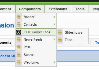
Access the component administration pages by selecting "JXTC Power Tabs" option from the Joomla! administration Components menu.
Creating and Configuring Tab Slideshows
 Select the Slideshows menu option; this will take you to a list of all slideshows defined in your system. To create a new slideshow, click on the "New" icon in the top right.
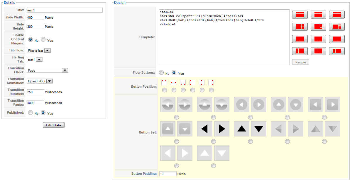
The Slideshow edition page will let you define the main attributes and features of the slideshow:
Detail parameters:
- Title
- A unique title for the slideshow. This used for reference, only.
- Slide width
- Specifies the width (in pixels) of the slideshow area (this is not the width of the entire display area).
- Slide height
- Specifies the height (in pixels) of the slideshow area (this is not the height of the entire display area).
- Enable Content Plugins
- This enables or disables the use of Joomla! content plugins inside the Slides or tabs contents.
- Tab Flow
- Specifies the initial display order for tabs and slides.
- Starting Tab
- Specifies the first tab to display. If there are no tabs defined yet, the legened "There are no tabs assigned to this slideshow yet." will appear. If this parameter is not set, the default will be the first tab defined.
- Transittion Effect
- Select the type of transition effect to use when changing slides.
- Transition Animation
- Each animation effect can be applied in different ways, choose any option of you preference here.
- Transition Duration
- Specifies the time (in milliseconds) to perform the transition effect between slides.
- Transition Pause
- Specifies the time (in milliseconds) to wait between automatic slide transitions. A value of "-1" will disable automatic transitions.
- Published
- Enable or disable this slideshow.
Design parameters:
- Template
- Here you can fully customize the display layout of the slideshow, read below for more information.
- Flow Buttons
- Enable or disable the clickable flow buttons.
- Button Position
- Available when buttons are enabled, this parameter selects their position over the slideshow area.
- Button Set
- Select the image set to use for flow buttons.
- Button Padding
- Specify the space around button images (in pixels).
Customizing Slideshow templates
The layout of a slideshow is set with a Template that contains the HTML code necessary to position the slideshow elements. This opens unlimited possibilities to create custom displays to fit your template looks and design needs without being restricted to only a few pre-made designs.
As a starting point, you can choose from twelve common layouts available by clicking on the icons at the right. You can leave the sample template code untouched or decide to edit it to suit your design needs. If you change your mind after modifying the template, click on the "Restore" button to recover your last-saved template.
The slideshow elements are positioned within the template layout by using special placement tags:
- {slideshow}
- This tag represents the "Slideshow area" where each slide content will be shown, the size is defined by the Slide width and Slide height parameters described before. Animation effects will be applied to this area only.
- {tab}
- One or more {tab} can appear in the lay out, you can add and position as many tab tags as you want. Each tab tag will be replaced with the contents of the Tab design (as defined in the Tab settings, see below) for display. The tabs will be replaced in order from top-left to bottom-right to their corresponding tab. If there are more tags than actual tabs, they will be removed from the template. Likewise, if there are less tags than actual tabs, the remaining tabs will not be shown.
- {text: abcde}
- This tag embeds a custom text string in the layout, useful to display custom messages or other information. For example: {text: Hello There!} will display a "Hello There!" string. These strings are subject to language translation according to your system settings.
Adding Tabs and Slides
 Tabs and Slides are the visible elements of a Slideshow, each tab has a slide that becomes visible in the Slideshow Area when the tab is clicked or automatically activated. To see the list of existing tabs go to the "Tabs" menu option of the component. Click on a tab name or the "New" button in the toolbar to create a new one:
Detail parameters
- Title
- A unique title for the tab. This title is available as a placement tag (see below).
- Parent Slideshow
- Specifies the slideshow than will contain this tab.
- Tab Width
- Specifies the width (in pixels) of the tab.
- Tab Height
- Specifies the height (in pixels) of the tab.
- Published
- Enable or disable this tab.
Custom Texts parameters
- Text 1
- A custom text string available as a placement tag (see below).
- Text 2
- A custom text string available as a placement tag (see below).
- Text 3
- A custom text string available as a placement tag (see below).
Tab Settings parameters
Tabs can have two states: "active" and "inactive". The active state corresponds to the slide currently being shown, whereas the inactive state corresponds to slides not visible at the moment.
- Tab Type
- Tabs can consist of an image file or custom HTML code, choose the type type here.
- Active Tab Image
- For Image mode, this parameter allows to choose which image file to use.
- Inactive Tab Image
- For Image mode, this parameter allows to choose which image file to use.
- Custom Active Tab Design
- For custom mode, this parameter allows you to enter the desired HTML code.
- Custom Inactive Tab Design
- For custom mode, this parameter allows you to enter the desired HTML code.
Custom designs can be entered from scratch or you can select a pre-made base design. To use any of the sample designs, click on the desired design code area and then click on the sample design from the right. The corresponding code will be entered automatically for you. For your convenience when developing custom designs, there are a few useful placeholder tags available: {live_site} represents the site's URL, {width} is the tab width (in pixels) and {height} is the tab height (in pixels).
Slide Settings parameters
Slides are shown in the Slideshow area whenever a tab is clicked, or an automatic animation takes effect.
- Slide Type
- The slide can consist of an image file, a Joomla article or custom HTML code. Choose the desired type here.
- Slide Image
- For Image mode, this parameter allows to choose which image file to use.
- Slide Link
- For Image mode, an optional link URL can be specified to make the slide itself clickable.
- Slide Link Mode
- This defines whether to open the optional link URL in the same browser page or a new one.
- Article
- For Joomla article mode, this parameter allows you to select one of the available joomla articles as slide content.
- Article Text
- Joomla articles can contain an introductory text besides the main article text. Use this parameter to select which one to show.
- Custom Slide Design
- For custom mode, this parameter allows you to enter the desired HTML code. Certain placement tags are available for inclusion (see below).
Showing slides
After a slideshow is created and tabs added to it, there are two ways to display it on the frontpage:
Creating a slideshow menu option
To make a menu option link to a slideshow, you should use the standard Joomla! Menu Manager to edit the desired menu, and then follow these steps:
- Click on the "New" icon in the top left to create a new menu entry
- Next, click on "JXTC Power Tabs" from the Menu Item Type selection and then again on "Display a Tab Slideshow"
- On the menu entry settings page, edit the fields on the left "Menu Item Details" area according to your preference
- On the right side, open the "Parameters (basic)" tab and select which slideshow to display.
- If needed, open the "Parameters (System)" tab and edit the fields as you wish
- Click on the "Save" or "Apply" icons on the top left to store your changes
You have now created a menu link that will display a slideshow.
The Second option is to use the Power Tabs Module to display a slideshow on any module position. Be aware that module positions tend to be smaller and your slideshow dimensions might be too big to fit properly. To configure the Poer Tabs module follow these steps:
- Select the "Extensions / Module Manager" menu option in the Joomla administration screen
- Locate the mod_jxtc_powertabs module to configure and open it to edit the parameters
- Edit the parameters to enable the module and set Details and Menu Assignment options according to your needs
- On the right side, choose the slideshow to display
Extending the component
You can extend some of the component features such as Flow Buttons and Tab designs by including your own. Just follow the same folder structure in the "tabs" and "buttons" folder of the component to add more images and designs. Once your files are included, the component will present them as options when adding or editing tabs and slides.
Copyright 2011 Monev Software LLC
www.joomlaxtc.com